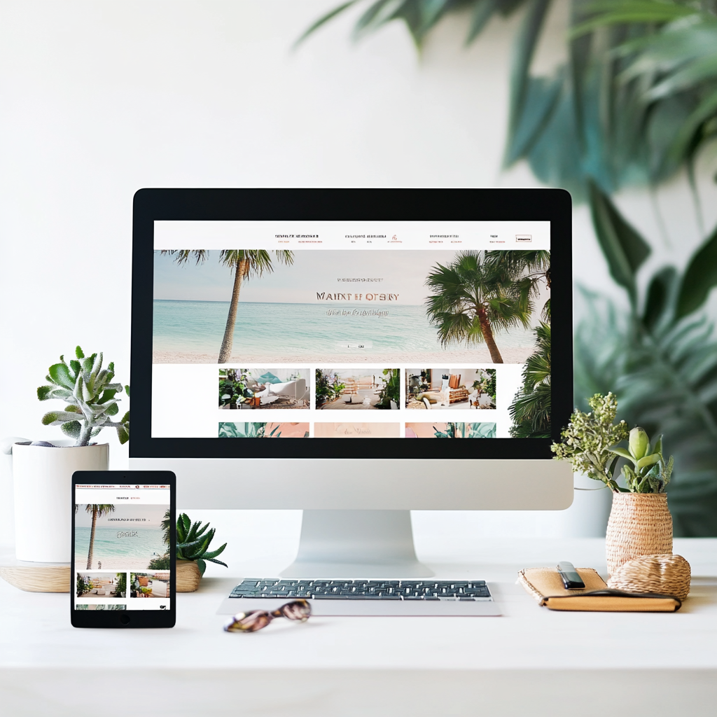
In the sun-soaked digital landscape of Fort Myers, your website needs to shine on every screen—from the smartphones of beach-goers to the desktops of busy professionals. Responsive web design isn’t just a trend; it’s a necessity for businesses looking to thrive in Southwest Florida’s competitive online market. But what exactly makes a website truly responsive, and how can you ensure your Fort Myers business is making the most of this essential approach? Let’s dive into seven game-changing strategies that will transform your web presence, ensuring your site looks stunning and functions flawlessly across all devices.
- Mobile-First Design: Prioritizing the Palm-Sized Experience
In Fort Myers, where life often revolves around outdoor activities and on-the-go experiences, mobile users are your primary audience.
Key actions:
- Start your design process with the mobile layout
- Focus on essential content and features for smaller screens
- Progressively enhance the design for larger devices
Did you know? 70% of web traffic in Florida comes from mobile devices. Prioritizing mobile design isn’t just smart—it’s essential for reaching your Fort Myers audience.
- Fluid Grid Layouts: Flexibility for Every Screen Size
Just as the waters of the Gulf adapt to any container, your website should fluidly adjust to any screen size.
Implementation strategies:
- Use relative units (%, em, rem) instead of fixed pixels
- Implement CSS Grid or Flexbox for flexible layouts
- Test your design across a wide range of devices and screen sizes
Pro tip: Tools like Chrome DevTools allow you to simulate various device sizes, perfect for testing your Fort Myers site’s responsiveness.
- Responsive Images: Crystal Clear Across All Devices
From showcasing Fort Myers’ beautiful beaches to highlighting your products, images play a crucial role in your website’s appeal.
Techniques to consider:
- Implement srcset and sizes attributes for serving appropriate image sizes
- Use CSS to ensure images scale properly within their containers
- Consider lazy loading for improved performance on slower connections
Remember: Optimizing images can reduce page load times by up to 80%, crucial for retaining impatient mobile users.
- Typography That Adapts: Legibility in Every Scenario
Whether your visitors are reading under the Florida sun or in a dimly lit office, your text needs to be clear and easy to read.
Best practices:
- Use relative units for font sizes (em or rem)
- Implement a modular scale for consistent typography across devices
- Adjust line height and letter spacing for optimal readability on smaller screens
Did you know? Proper typography can increase engagement time on your site by up to 25%, keeping Fort Myers visitors interested and informed.
- Touch-Friendly Navigation: Effortless Exploration for Every User
From tapping on smartphones to clicking on desktops, your navigation should be intuitive across all devices.
Key considerations:
- Implement larger touch targets for mobile users (minimum 44×44 pixels)
- Use expandable menus or off-canvas navigation for smaller screens
- Ensure hover states have touch equivalents for mobile users
Pro tip: Consider the “thumb zone” when designing mobile layouts, placing important elements within easy reach.
- Performance Optimization: Speed That Impresses in the Sunshine State
In the fast-paced world of Fort Myers, a slow website is a forgotten website. Responsive design must go hand-in-hand with speed optimization.
Strategies to implement:
- Minimize HTTP requests by concatenating files
- Leverage browser caching for returning visitors
- Use a content delivery network (CDN) for faster global access
Remember: A 1-second delay in page load time can lead to a 7% reduction in conversions. In Fort Myers’ competitive market, every second counts.
- Content Prioritization: Delivering What Matters Most, Regardless of Device
Not all content is created equal. Prioritize and adapt your content to provide the best experience on every device.
Techniques to consider:
- Use progressive disclosure to reveal content as needed
- Implement collapsible sections for less crucial information on mobile
- Adjust content order to highlight key information on smaller screens
Pro tip: Conduct user testing with Fort Myers locals on various devices to ensure your content prioritization meets local needs and expectations.
Frequently Asked Questions:
Q: How often should I update my responsive design?
A: While the principles of responsive design are evergreen, it’s good practice to review and refresh your approach annually to keep up with new devices and best practices.
Q: Will responsive design affect my SEO?
A: Positively! Google favors mobile-friendly websites, and a well-implemented responsive design can improve your search rankings.
Q: Is it better to have a separate mobile site or a responsive design?
A: In most cases, a responsive design is preferable. It’s easier to maintain, provides a consistent user experience, and is favored by search engines.
Q: How can I test my website’s responsiveness?
A: Use tools like Google’s Mobile-Friendly Test, Browser Stack, or simply resize your browser window to simulate different screen sizes.
In the diverse and dynamic digital ecosystem of Fort Myers, responsive web design isn’t just a technical requirement—it’s a gateway to connecting with your audience wherever they are, on whatever device they choose. By implementing these seven game-changing strategies, you’re not just adapting to different screen sizes; you’re creating an inclusive, user-centric experience that resonates with the vibrant spirit of Southwest Florida. Remember, in the world of web design, there’s no one-size-fits-all solution. But with a responsive approach, you’re ensuring that your site fits perfectly on every screen, captivating visitors from the beaches of Sanibel to the boardrooms of downtown Fort Myers. Embrace these strategies, and watch your digital presence flourish across the entire spectrum of devices.


